Likes, Comments, & Social
Ancestry
Mobile apps (iOS, Android)
UX Design, Lead.
2022
Team setup: 1 design lead, 1 product manager, 3 iOS engineers, 3 Android engineers. Shipped in Q3 2022. Measured impact until Q3 2024.
Ancestry is the foremost place to do family history research online. What does that mean? And what does it do for people?
Firstly, Ancestry gives a person the content of family history research. The content itself—birth records, marriage records, death certificates, census entries, ship passenger lists, and so on,—is hosted on the app, and nowhere else.
Secondly, Ancestry gives a person the tools that are necessary to find the right content. Records and relationships between ancestors are found via an entire suite of features that the software developed over time. Some are intuitive, easy to use, and apt for beginners. Some take time to learn and are the subject of fascination of intermediate users.
Thirdly, Ancestry gives people a chance to find each other. People are the treasure of family history: finding out what they know, how they relate to you, and the stories and photos they've found themselves are among the most rewarding pursuits in the hobby.
The lifecycle of a historical photo at Ancestry
There is only one person whose parents are also my parents. However, there are nine people whose grandparents are also two of my grandparents. I share a single set of great-grandparents with sixty people, and I have eight sets of them.
The amount of family facts and pictures I possess could be interesting to a potentially large amount of people. Some of them are well known to me, some I would recognize their names, and some are complete strangers to me.
The reverse is true. The facts and pictures I am looking for could be in possession of a large amount of people, very few of whom I would know how to contact if I wanted to: it is in these region of relatedness that Ancestry connections are made.
User-generated content metrics
The mobile product and design team began the second quarter of 2022 focused on increasing the amount of content uploaded to Ancestry by its users.
There are three key reasons for this. Firstly, family photos create a 'value moat' for the product: if the perception is that all family photos are on Ancestry, people are more likely to choose Ancestry to have their photos in the same place as everybody else. Secondly, family photos are hinted to other customers, so more photos make the product more valuable for tenured and new users alike.
And thirdly, family photos become hubs of connections in between people. Not only the user that posts and the user that merges that photo in their tree, but potentially everybody else that merges that photo in their tree. Customers that make connections have a significantly higher life-time revenue.
Three teams were directed to ship UGC-increasing features in the same quarter. One developed social media-style stories, another launched a robust photo scanner, and the third, my own, began this journey about making a photo upload more valuable by making visible the social layer on top of them.
Private, direct messaging
For a product that thrives on connections, the Ancestry app has surprisingly few channels through which people might start talking to each other.
If two people are not matched by a DNA kit, there are only two ways of finding each other in the network:
· Searching and finding the owner of a public family tree.
· Being suggested a common ancestor with the owner of a public family tree.
Once two people find each other, the only way to talk is through a private, direct messaging service.
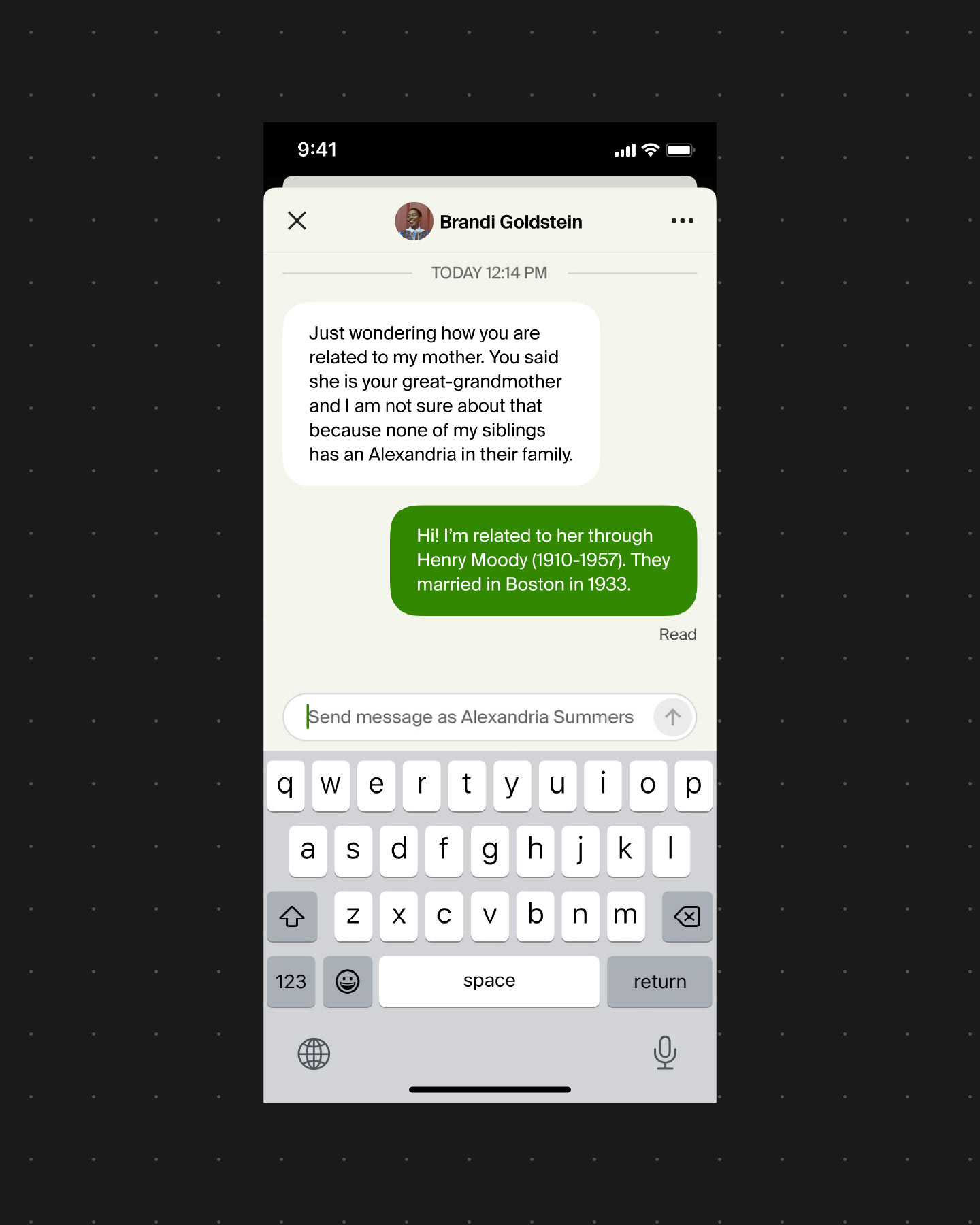
The app pays a high cost for depending on these direct messages to foster conversation between people: the rate of peer-to-peer interactions is lower than we would expect.
We know from internal user experience research that a customer is more likely to report overall satisfaction with the app if they've sent and received messages from others. On the other hand, not sending or receiving messages from others is a staple characteristic of customers who grow disillusioned with the app and churn.
User research summary
We organized a series of interviews to listen to what people had to say about interacting with others in the app.
Synthesis
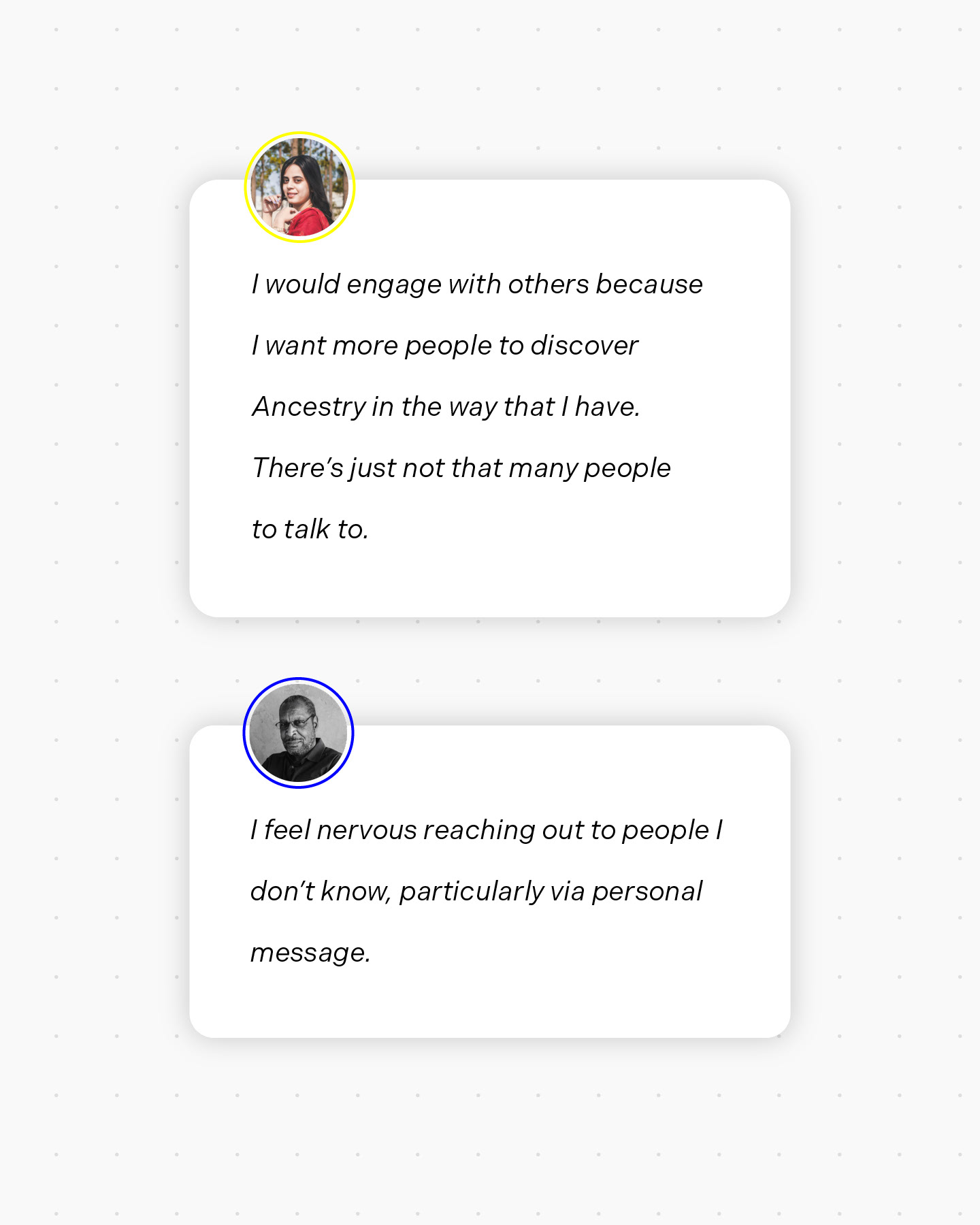
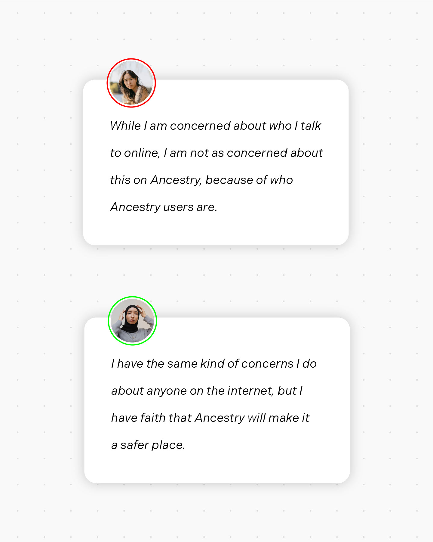
1. People would be glad to reach out to others and the app seems to be getting in their way, rather than help.
2. People find it daunting to start a conversation with a stranger in a direct message.
We mapped the journeys people take from just starting to feeling very comfortable in the app and realized the following: sending and receiving a message usually happens very far into the experience—it's not until a lot else has happened that the app makes the networking features make sense for a person.
User research insights
1. Make the networking features make sense earlier: effectively bring communication with others into the app's core loop.
2. Break out of direct messages as the only way to reach out to someone.
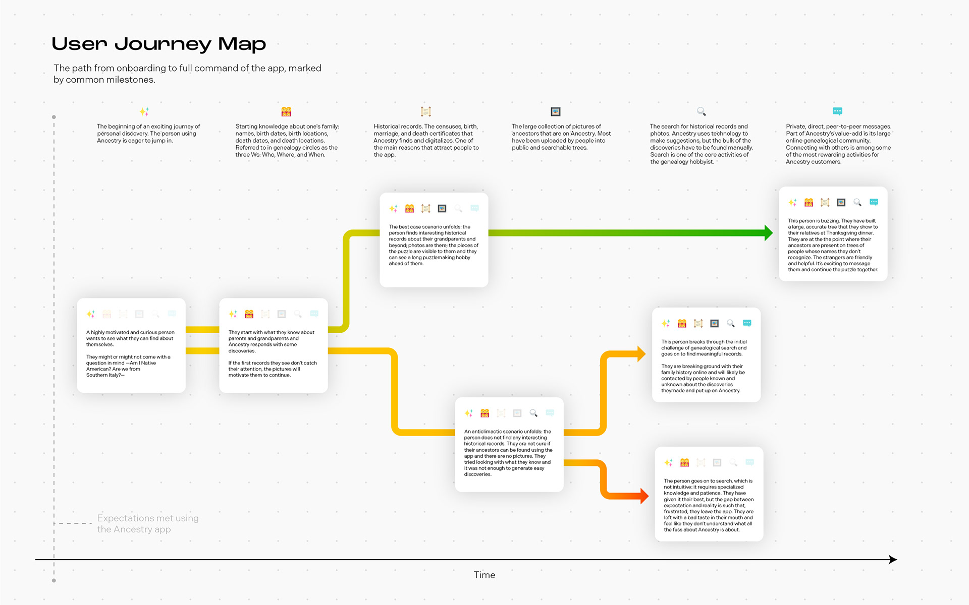
At this point in the research, we revisited the user journey map from the perspective of our first insight:
How might we make communication with others part of the app's core loop?
When we got to the part of the journey map where a person finds their first historical records, often in the form of suggestions, something clicked. During one of the interviews, the same person who had said there were not that many people to talk to also described how she constantly accepts suggestions for records and photos and merges them to her tree.
The a-ha! moment meant realizing there has not been an effort so far to draw a social connection between people that manipulate the same data.
The remaining question is still:
How might we make communication with others part of the app's core loop?
To which we can add:
How might we draw a social connection between people manipulating the same data
Hypothesis
The straightest path to successfully making conversation part of the app is to place it right where people's incentives to have it are the most aligned: the historical records and photos they save to their family trees.
The effect of any possible peer-to-peer interactions associated with photos and records is far-reaching, given that these media are part of nearly all users' core loop of frequent activities they come do in the app.
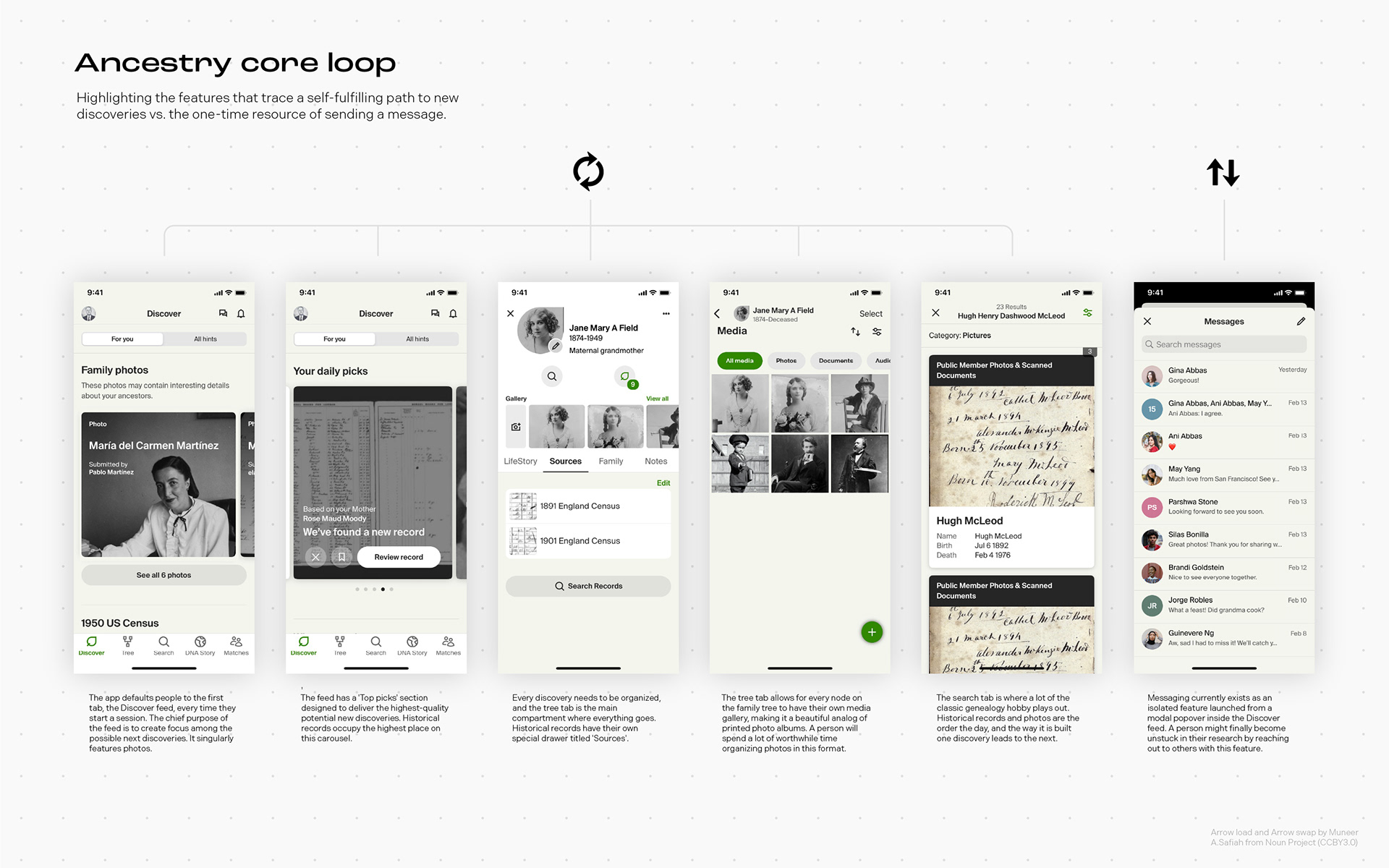
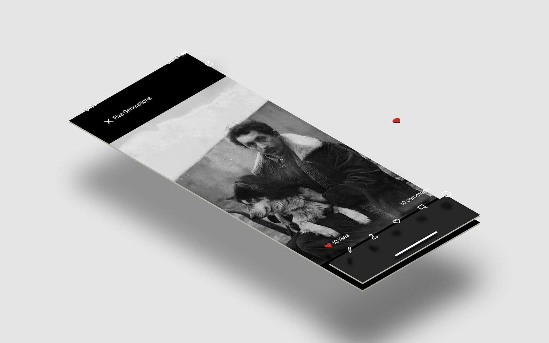
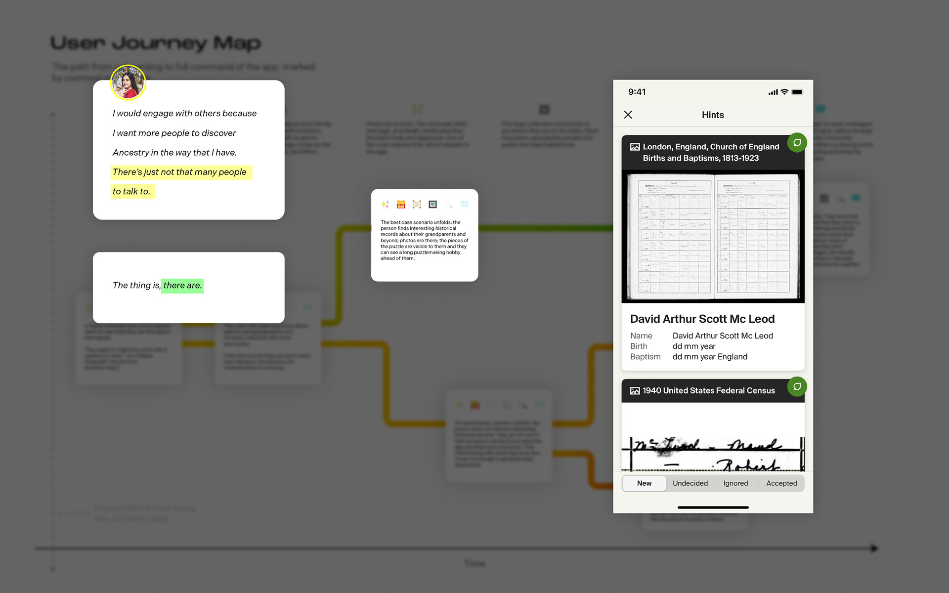
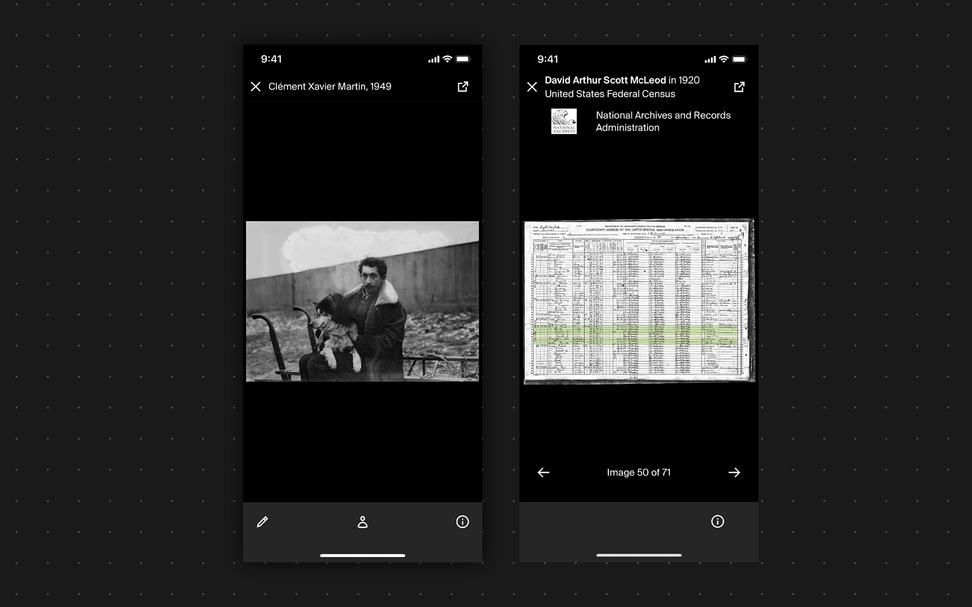
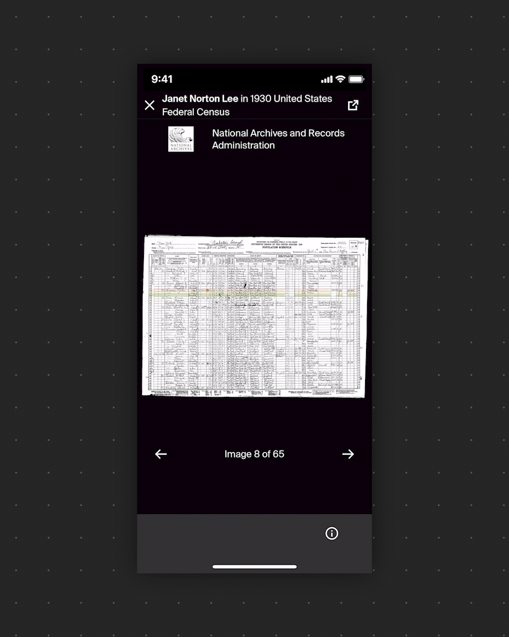
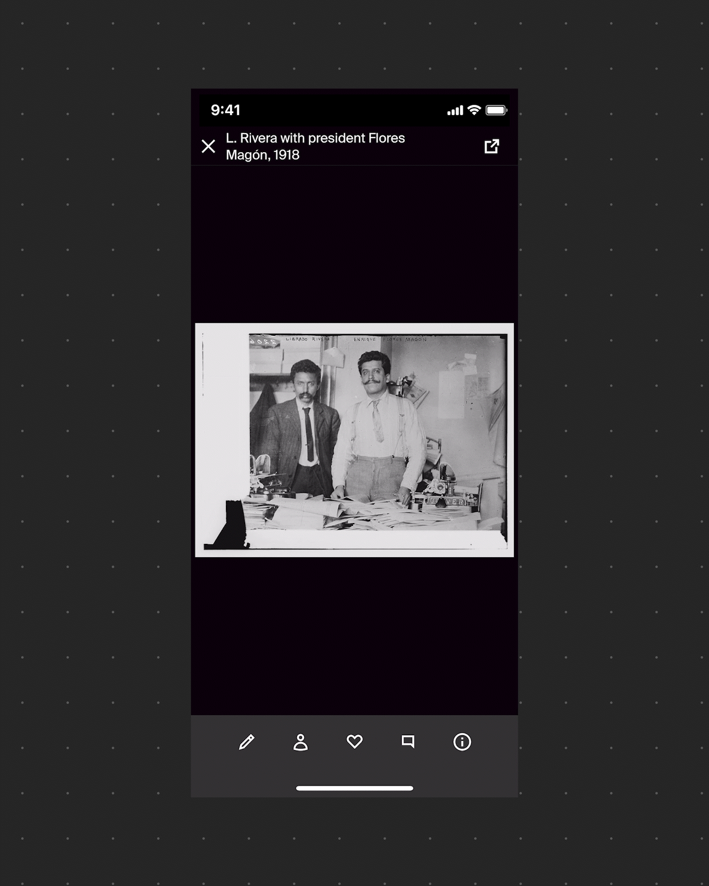
Considering the media viewers
These two screens in the app became the targets of the experiment to raise the number of peer-to-peer interactions.
Working with layers
The photos and records viewers are some of the most important user interfaces in the app, because the delight of finding, seeing, storing and sharing these documents is tightly knit with the unique value proposition of the product.
The viewers handle large amounts of information and tools via an elegant use of layers: the paper record or photo sits atop a black surface on top of which functionality appears and disappears following the gestures of the user.
A way to ensure the new peer-to-peer interactions feature fit nicely in the environment of the viewers became to fit the solution in a new layer.
Design solution
We started by asking the question: "Why are peer-to-peer interactions so low?", and continued once we found a correlation between the lack of these and an increased likelihood of churning.
We then talked to customers and found out they would like to talk to others, but the app is not showing them who else is there, and when it does, it can be daunting to reach out by private message.
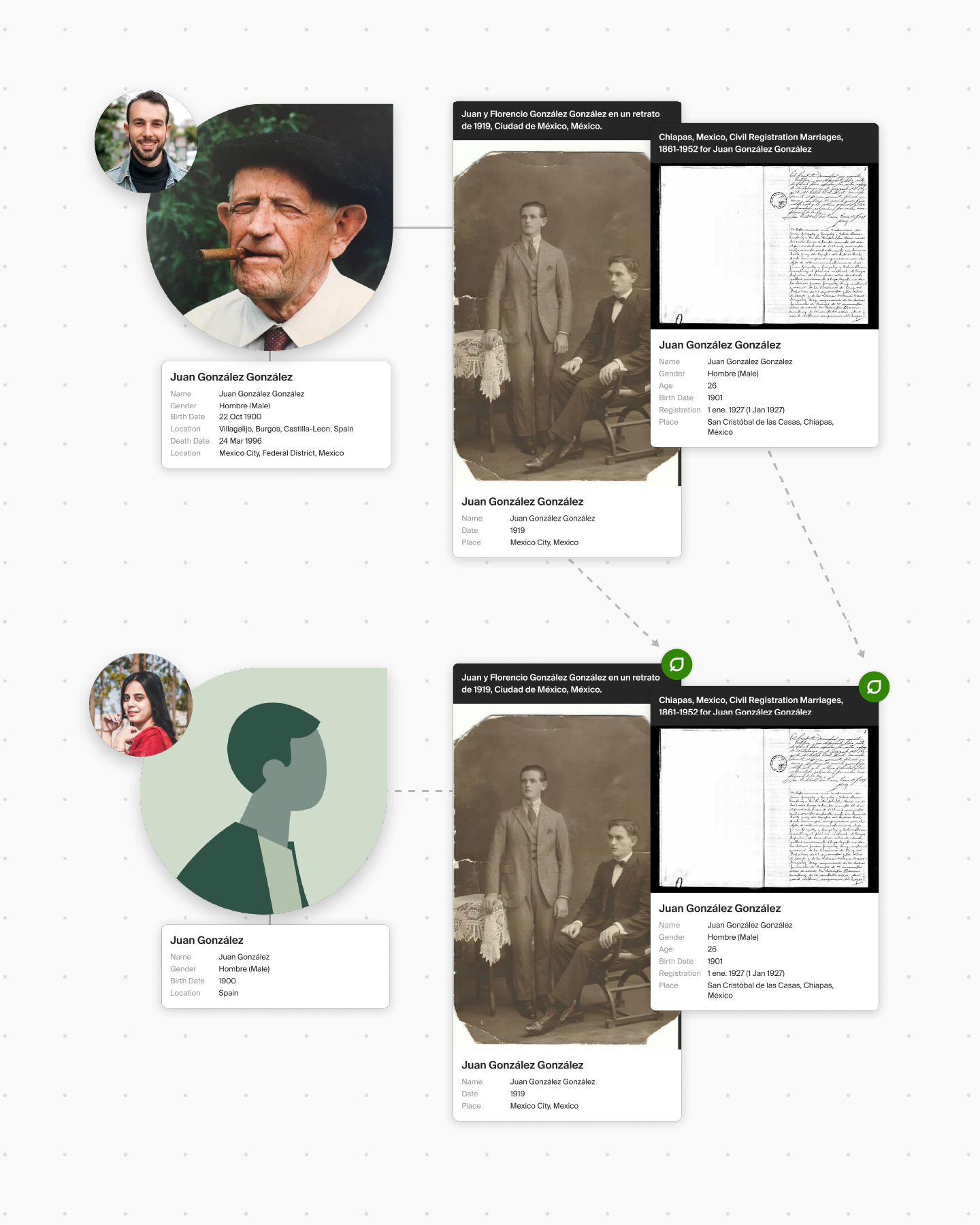
We then found an opportunity to expose users to each other by leveraging a feature of how record and photo hints work in the background, and found the right visual language to insert the solution in the right place.
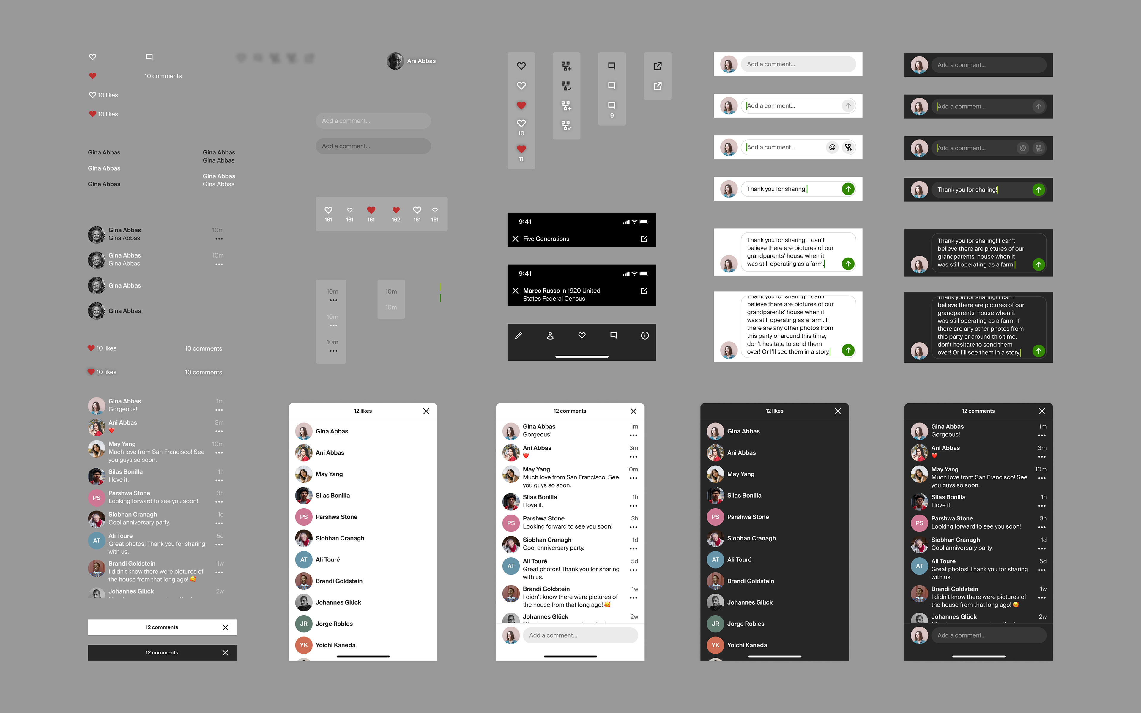
A low barrier of entry
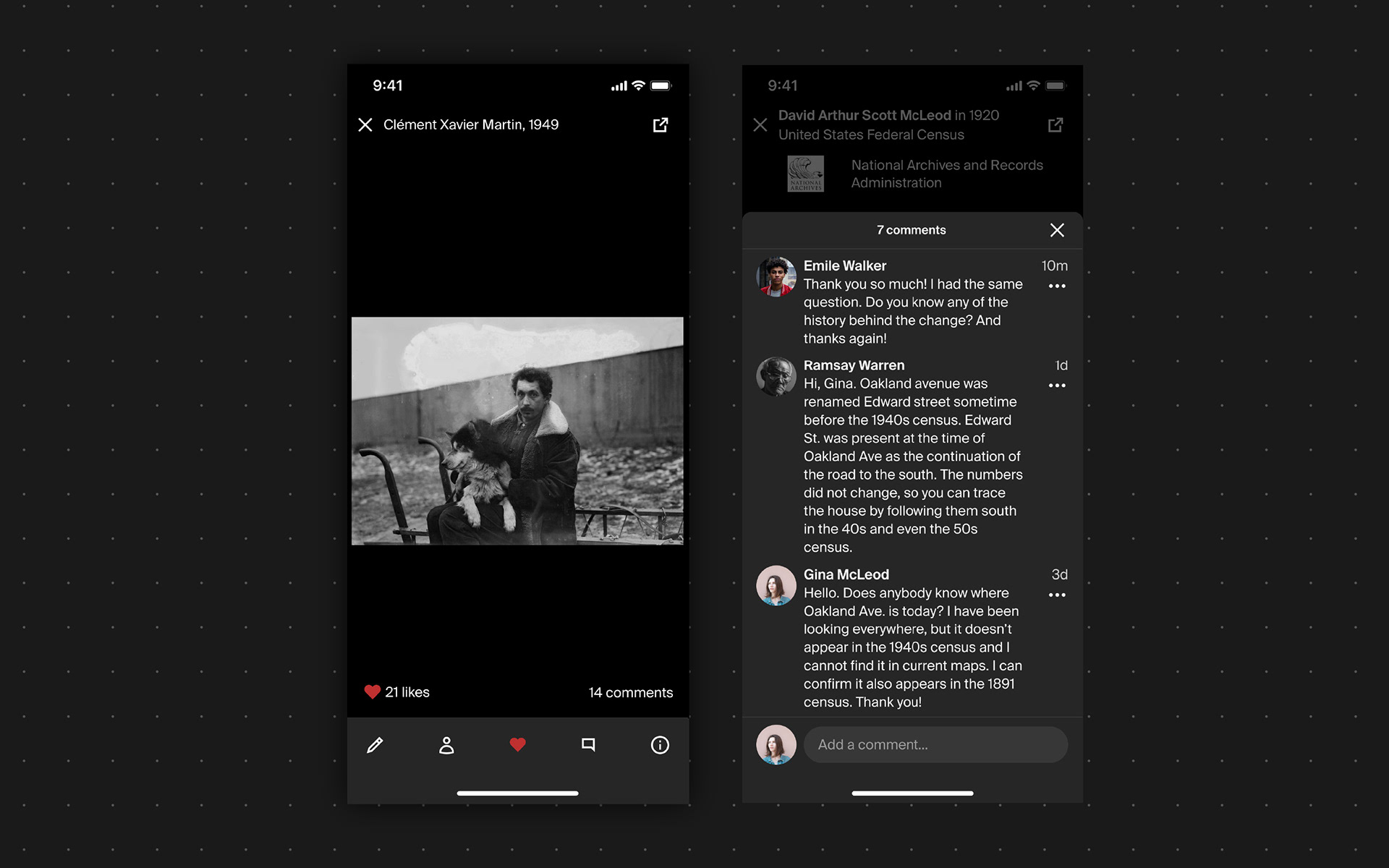
Sending a private, direct message requires motivation and something to talk about. In a shared photo or record, the subject of conversation is much more at hand, so posting a comment is low cost.
Placing a non-verbal like is even lower cost, and the perfect gateway to talking more in the future.
This GIF might take a second to load on your computer.
Product design hypothesis
The entire mobile organization started the second quarter of 2022 focused on increasing the amount of user-generated content that gets uploaded to the app.
The entire mobile app team began the second quarter of 2022 focused on increasing the amount of user-generated content in the app. One team built social media-type stories, another team built a photo scanner, and my team built the social media features: likes and comments in photos. The meaning of success became more clear:
If we launch likes and comments in photos, then users will upload more photos to the app because connecting socially through those photos makes having them at Ancestry more valuable.
Results
Likes and comments shipped in the iOS and Android apps in early November of 2022. Looking at our internal product analytics in hindsight, the first needle we expected to move was photo uploads.
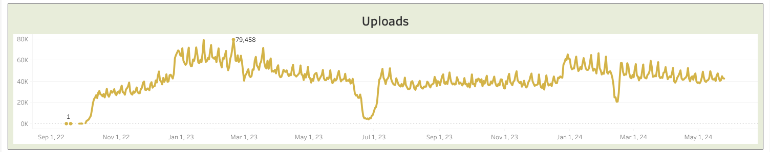
These numbers began to look reallly good. In between the social-media type stories, the photo scanner, and the added value of likes and comments, the team felt over the moon to bring uploads from around 25-30K per day in November to around 70-80k per day in January.
The data did trend that way until early March, when it began normalizing at around 40k per day through the fall of that year.
It's also worth looking at the number of unique users that upload media to the app:
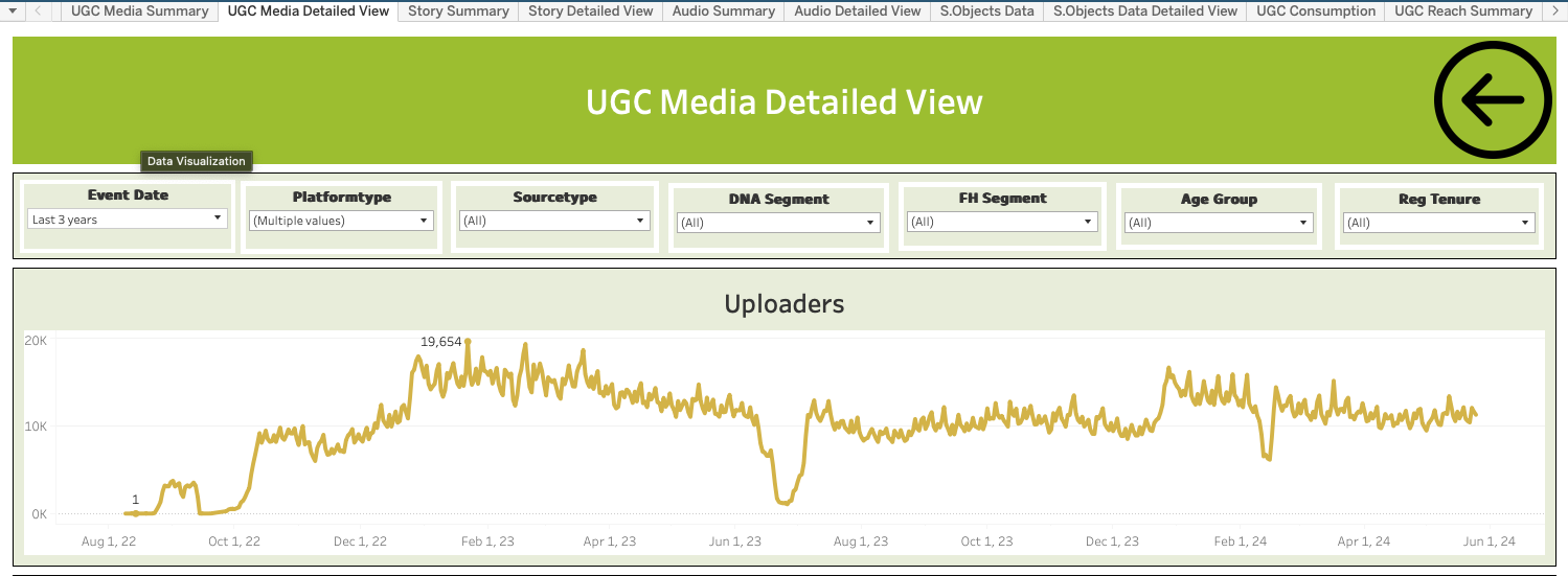
The trend follows the amount of UGC uploads closely, showing that nearly twice the amount of users were uploading media to the app in February of 2023 compared to December of 2022.
At this point, it paid to look at how many of these increased uploads were the result of having added the photo scanner, which interestingly, produced the following data:
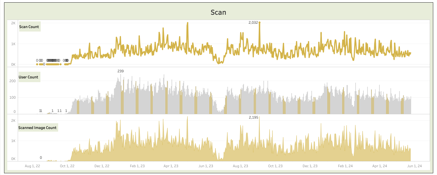
Scanning, turns out, was only responsible for around a thousand of the daily uploads, with a couple outlying days.
The team then turned to the social media-type stories, sure that they were responsible for the dramatic increase in UGC uploads.
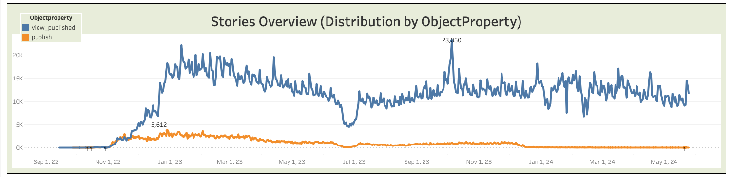
Which, turns out, was not the case. UGC stories was only responsible, at its peak for 3k units of UGC upload per day, usually less than that.
It is very interesting to look at the effect of focusing on UGC uploads now that more data has accumulated since the time of the launch of likes and comments. The following chart tells an interesting story: the increase of UGC uploads overall after the initial launch of the features centered in UGC.
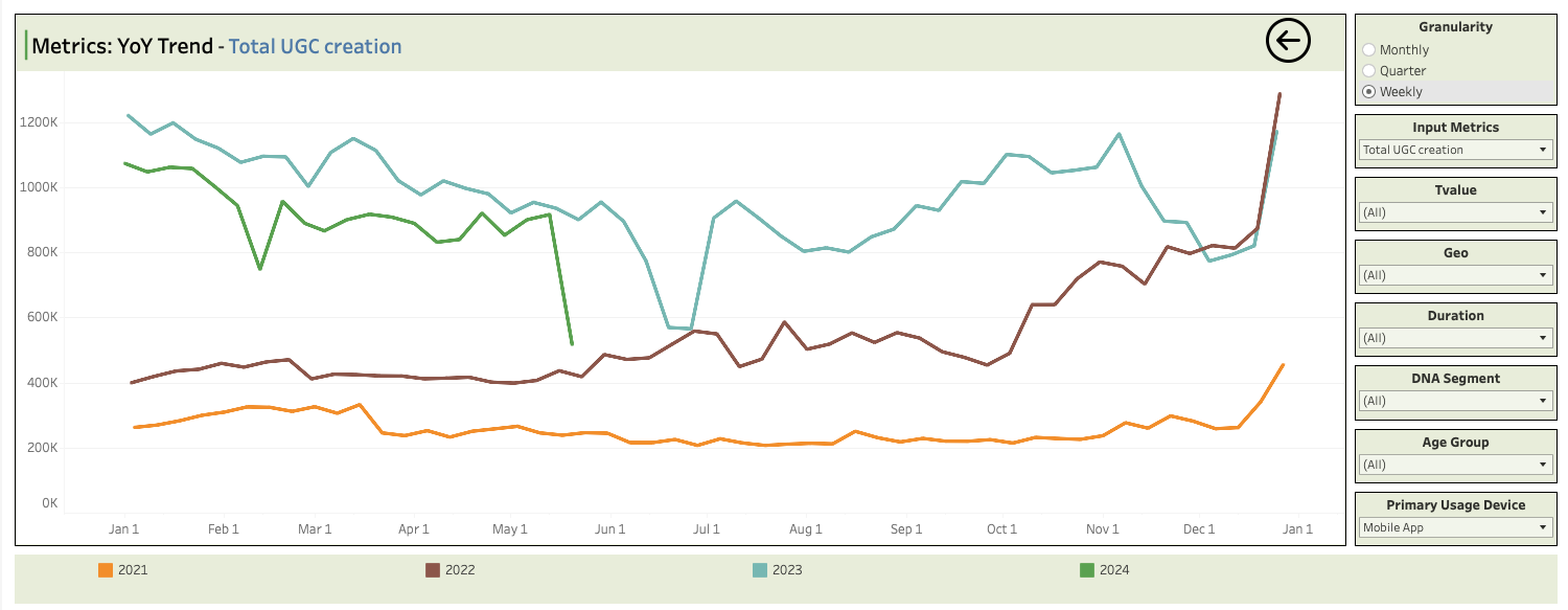
The data story that follows is interesting, but best spoken to in a small group.