Project setup: 1 scrum team (3 iOS/3 Android engineers), 1 product manager, 1 designer. 1 business quarter to ship (Q1 2022). Data maturation for 1 year (Q1 2022-Q1 2023)
The Ancestry product team knows through data that desktop users convert and retain at a higher rate when they also use the mobile app.

And even though there are kinds of users that behave on native mobile in ways user experience research would suggest are characteristic of desktop-only users, there is a significant difference in the kind of experiences at which the native mobile apps excel, and that are at the heart of the success of the mixed-platform cohort.

In a nutshell: the desktop app is excellent at a number of flows, the mobile app is excellent at a number of different flows, and users that take advantage of both are among the happiest brand loyalists.

What does the family historian do every day?
The heart of personal genealogy is telling stories, and the raw material of stories are facts. So a lot of family historians spend ample time gathering new facts, verifying facts, and organizing these facts into large structures.

The organization of facts into large structures is best suited for the desktop computer, where the large screen real estate helps synthesize bite-sized facts into a narrative. A good example of this might be telling the military history of a single ancestor, which might be gleaned from a series of draft cards, soldier and veteran rolls, and pension records.

Gathering and verifying new facts might happen anywhere: not only at their desk, but around the table at a family reunion, a field trip to a graveyard or library, and abroad, where immigrant ancestors lived. This is where taking their desktop work with them and feeding it on the go crosses platform boundaries for the best experience.​​​​​​​

But the family genealogist is thinking about their hobby more constantly than the active hours at their desk, and often look at their phones to feed it: the necessity to serve these customers is where the Discover feed began.
What does the Discover feed do?
The Discover feed operates on the principle that a family tree is a data structure so complex it cannot be fully approached on a whim.

Rather, like a stone house built out of pebbles, it is built and maintained a little at a time. The Discover feed offers the family historian a workbench with five or six pebbles, an app session's worth of their hobby whenever they please. In the feed they are presented with three or four of the best new records to review, a new person hint, and a concentrated list of all potential new records to add, should they want to take a bird's-eye view of jobs to be done. It launched in the app to great success.

After its launch, we received the insight that people were taking to the feed en masse, and were refreshing it more often than we could give them new things to look at. We got on the task of finding out what more they were expecting to see and do in the feed.​​​​​​​

When we spoke to customers about what they were doing in the feed they described opening the app casually, a few minutes at a time outside of their main blocks of time dedicated to the hobby.

Rather than the librarian-grade research tool that is the desktop app, people sounded more like they were opening Ancestry the way they do a crossword puzzle or the news. It became clear to us that any material improvement in new content in the feed would have to follow different principles.
New principles for feed content
We landed on three driving principles: Quick, Fun, and Low-cost.

We know an app session in the feed is the shortest time any user spends with Ancestry. Reviewing a record, properly vetting a new person hint, or finding new records to attach to an ancestor might be an afternoon's work. A user might only spend a few seconds with the Discover feed before backgrounding the app.

Also, there is plenty opportunity for gravitas in family history. The feed is one of the places where it can be fun, snappy, and playful.

Lastly, a lot of genealogical tasks are highly rewarding in exchange for a high cost (paid in time, money, or effort). We set ourselves on the challenge of producing as much delight for these users with as little input from them as possible.

So what is quick to consume, playful in nature, and expects the least from the user?
Metrics
If the hypothesis that shipping features that keep customers engaged in both web and mobile was true, the metrics that we would see increase are engagement with the feed and its sections, shares from the feed, and ultimately, gross subscriber additions.
Surnames
Surnames—ours and others'—are one of those things that are so right under our noses that it's easy to dismiss their poetics. Surnames can be short, spartan, and authoritative, elongated and ornate, and everything around and in between. In a way, we can change them, but there remains a certain permanence to them, within our own lifetimes and in the way they get passed down generations.

Surnames are old or new, certainly from somewhere, and give a whole lot of information about us. Whether one loves them or feels a certain way about them, every surname tells a story. They are interesting.

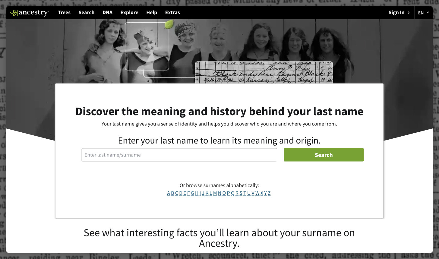
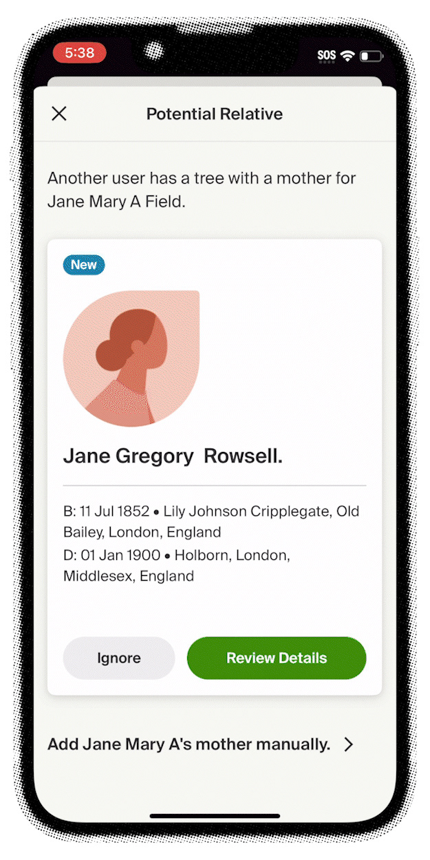
The web feature needs a manual search for the surname every time.


Doing research for this project we found out Ancestry has a special relationship with the Dictionary of American Family Names, an authoritative source that claims more than nine out of then people in the United States will find their family name explained in it.

The output from this source is compelling, easily searchable, and quickly consumable. And the best part is: an Ancestry user doing research on their tree constantly merges new nodes, which result in new surnames getting added to the family's history.

1. New record is saved. 2. New person gets added to tree. 3. Result of Dictionary query appears in the feed.

What was going on in the design team's psyche at the time? A collection of screens I had been putting together for other projects at the time reveal a pattern: editorial photography. Before this time the beautiful vintage imagery that Ancestry was known for in its marketing had never reached the product.

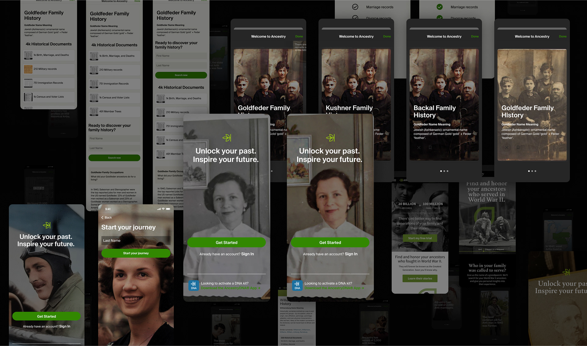
At this time an idea I had pitched for the launch screen was catching on in other parts of the app: feel-good editorial hero photography in black and white and color.

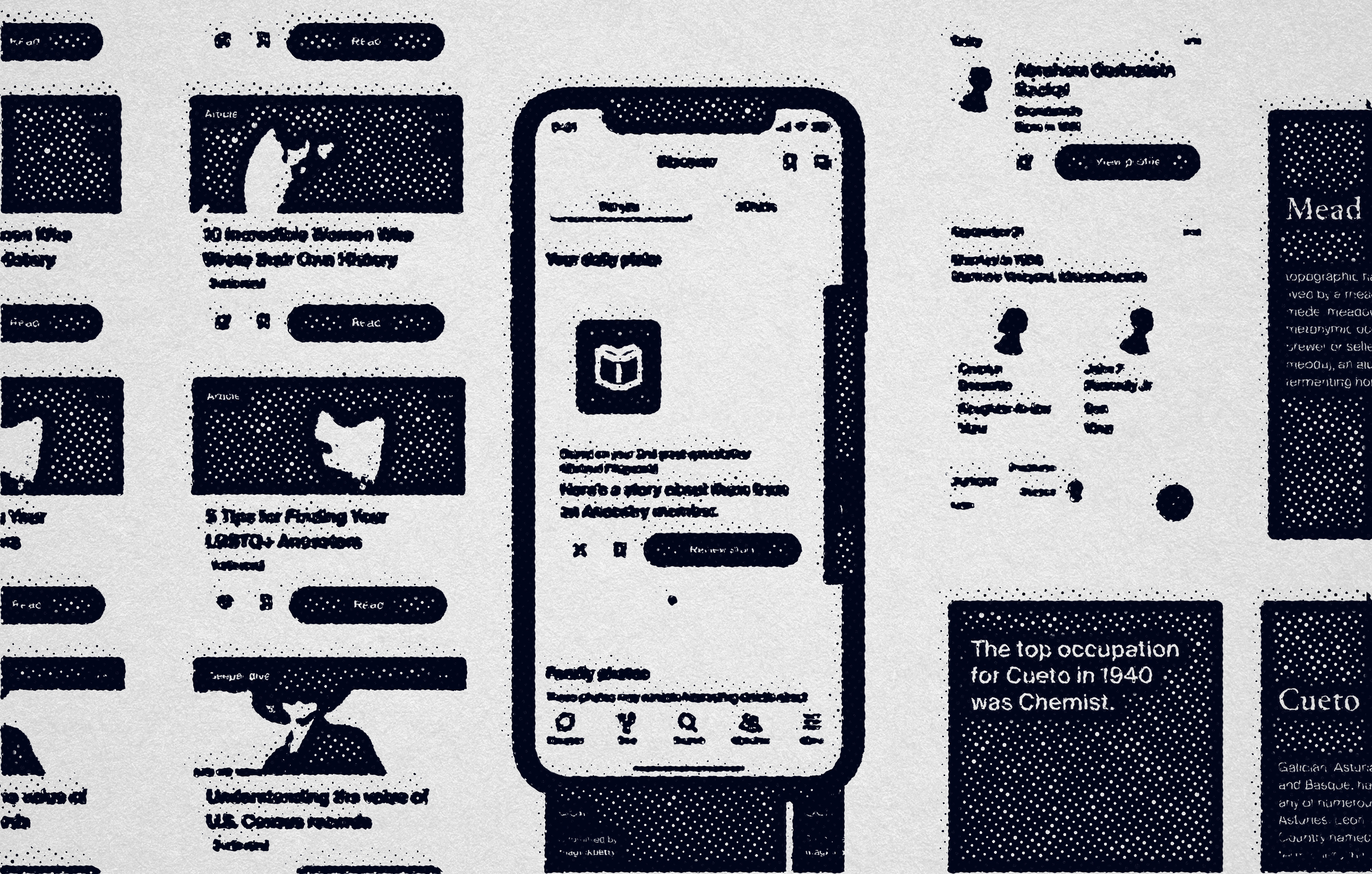
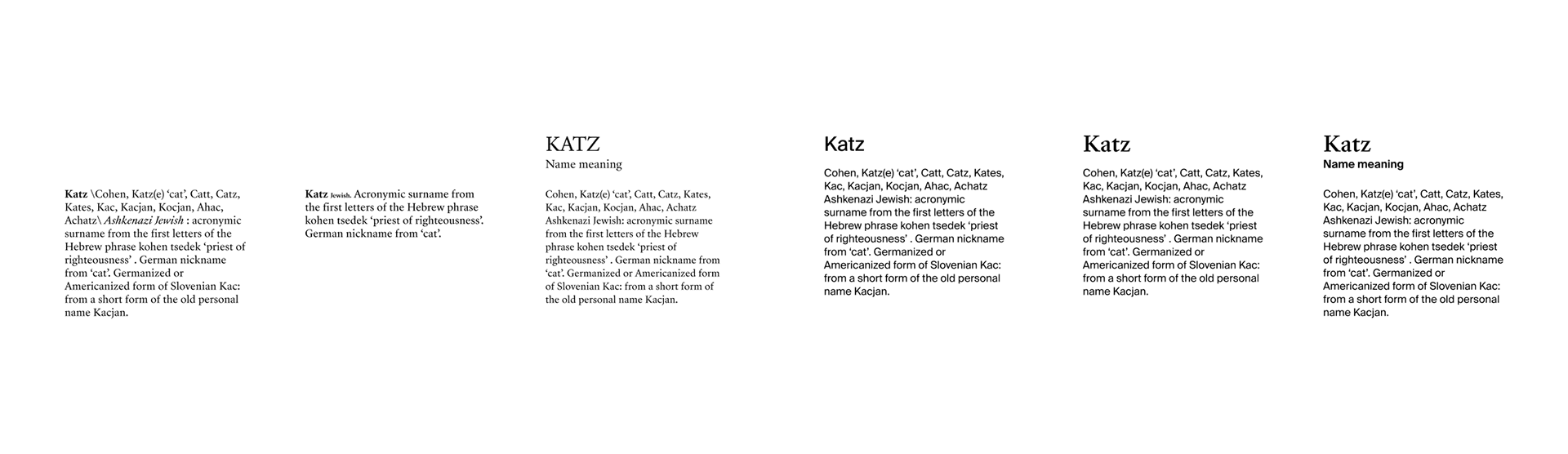
Early renderings of Surname meaning cards for the feed.

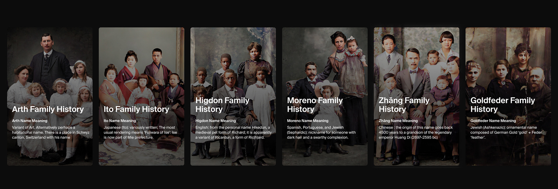
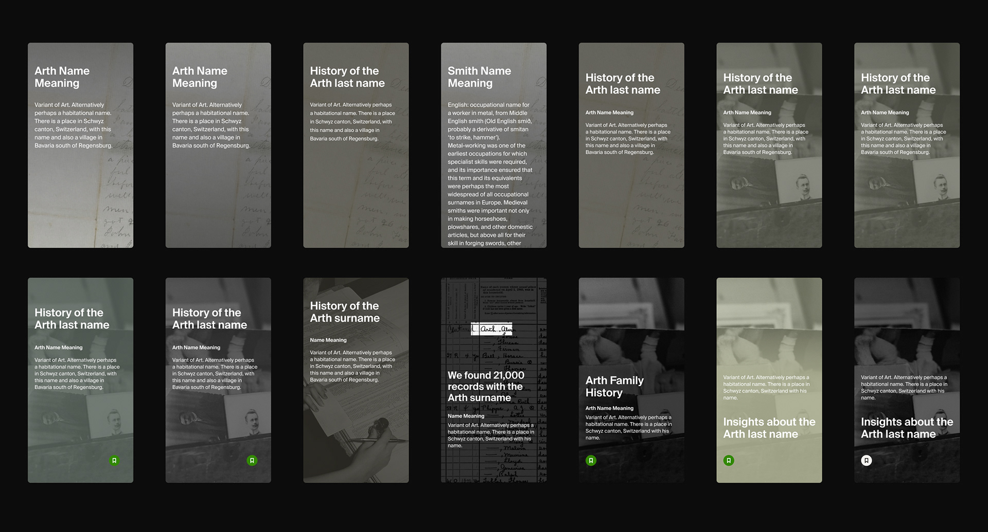
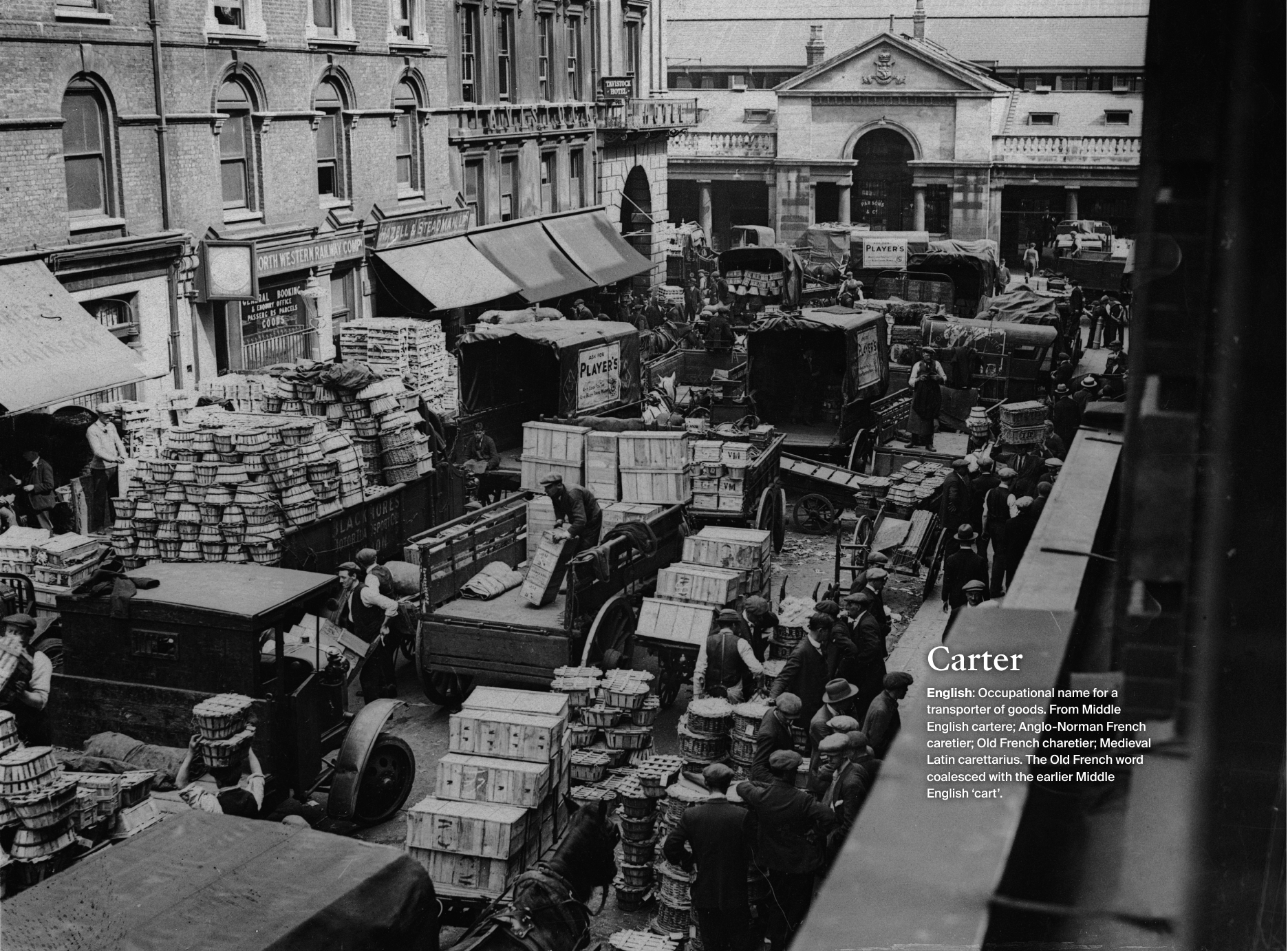
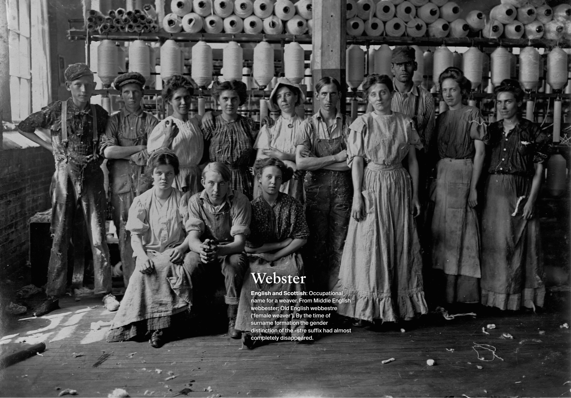
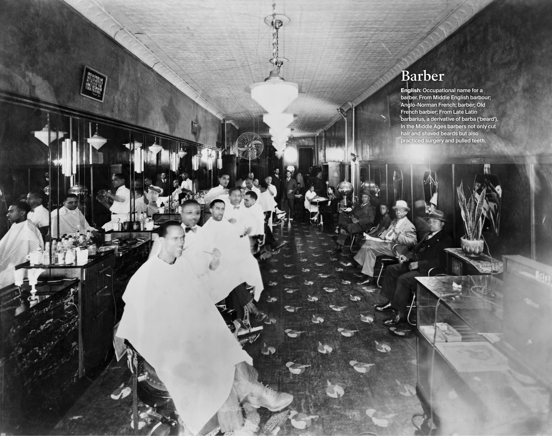
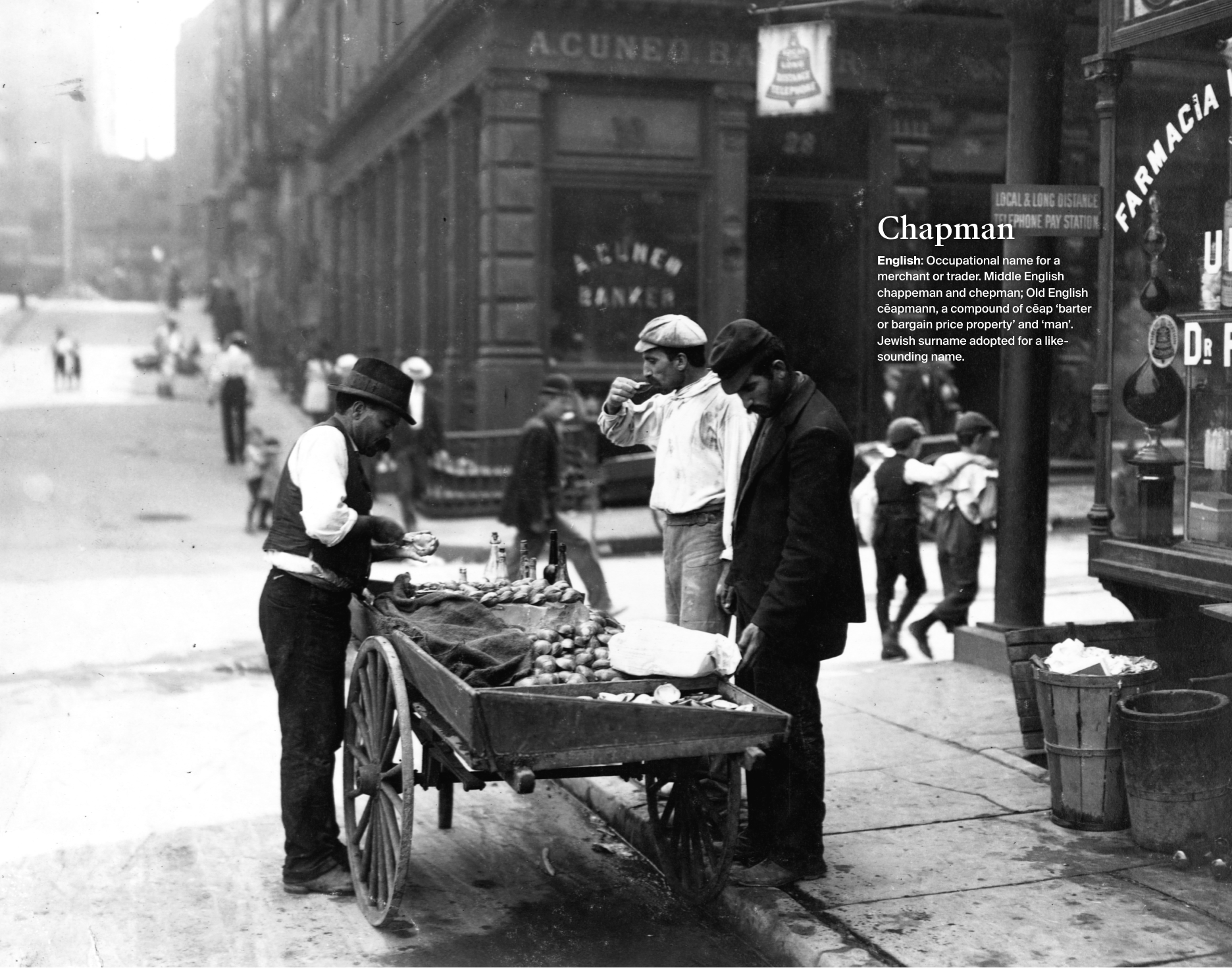
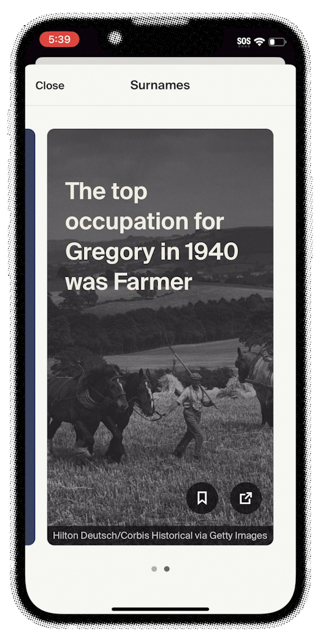
My favorite treatment of surname meaning cards: dignified, formal portraits of full families of every race from the first half of the 20th century. It could only stay an idea because it is, at heart, inaccurate for any one family.

The zeitgeist to include beautiful editorial photography in the designs reached its climax with the exploration of formal portraiture above. What these revealed was that the surname itself needed to be the star. I turned to layouts where a a word or a short phrase is the star: poetry and the dictionary.

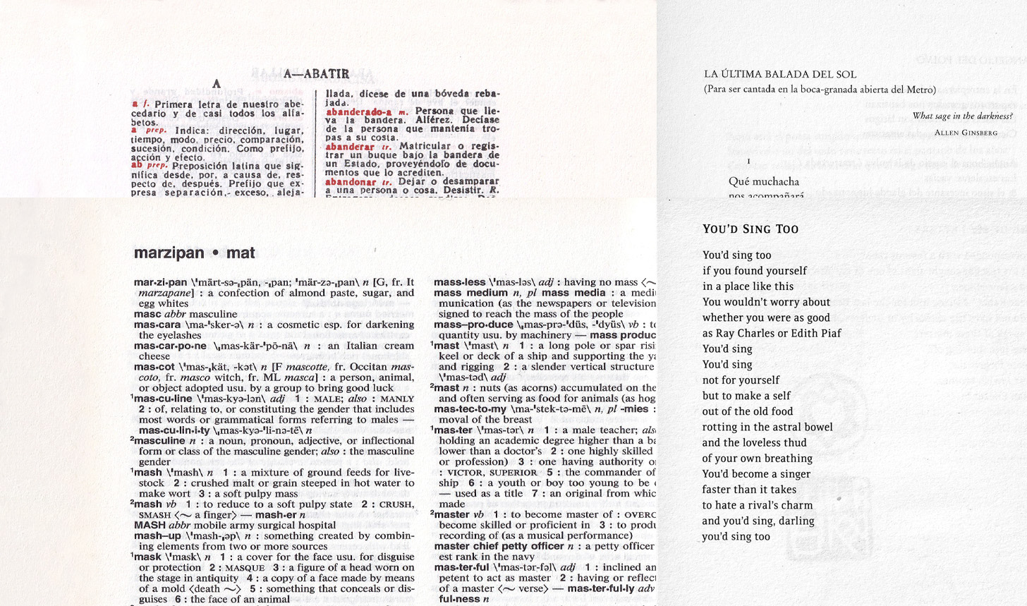
Credit to the specific texts here are Leonard Cohen, Mario Santiago Papasquiaro, and the Merriam-Webster and Porrúa dictionaries.

The dictionary treatment laid out as a section in the Discover feed.

We chose an arrangement of vibrant color solids to contrast with the surname rendered in an elegant serif and a matching tint.
The screen above describes the vision in high polish: a thumbnails section as part of the feed scroll that opens a full-screen carousel where the surnames have ample space to breathe. A personal Hollywood walk of fame for the surnames in your family.
Focusing the designs on typography left open the door to use editorial photography somewhere else, and the opportunity presented itself immediately. The Dictionary of American Family Names reflected the ancient connection of surnames with occupation (Think: Smith, Miller, Thatcher, Potter). It occurred to us we could cite this history and augment it with Ancestry's own census data, letting us make a connection in between the surname and occupations listed for it in the 1880 and 1940 censuses.
The demo above describes the result of this project in the production app. In it we see a person opening a 'New person hint' on their tree (Jane Gregory Rowsell). After they review the details, they merge the suggestion as a great-grandmother. We then see them navigate to the Discover tab. When they reach the Surnames section, we can see that Gregory has been pre-searched, and appears as surname meaning and occupation content.
Life Events
Birth, marriage, and death have a special place in the field of family history. Because these life events are tied to records they are technical subjects, valued by experts and in which hobbyists can gain experience. Events are everywhere in the app, since time is an important dimension of the family tree.

We decided to bring the anniversaries of these events to life in a new way inside the app, thinking about making them as easy to get to as possible and with our users' short app sessions in mind.

The way we did it was by collating the upcoming birthdays, marriage anniversaries, and death anniversaries and displaying them as separate sections in the Discover feed.

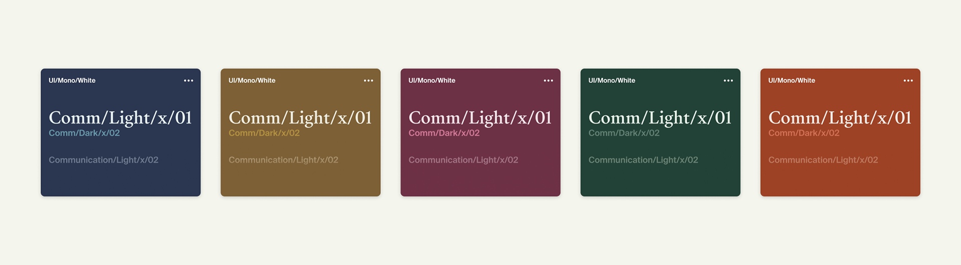
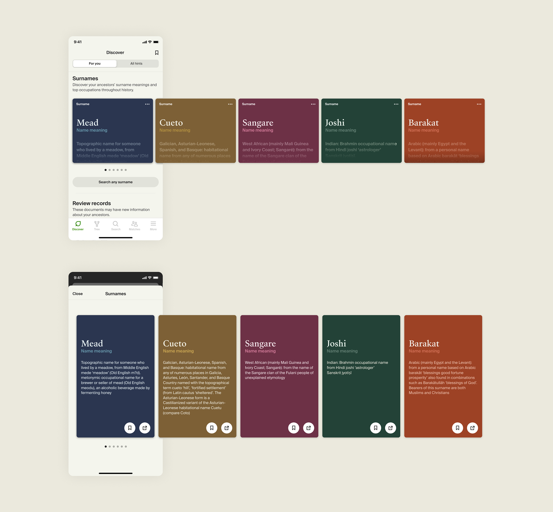
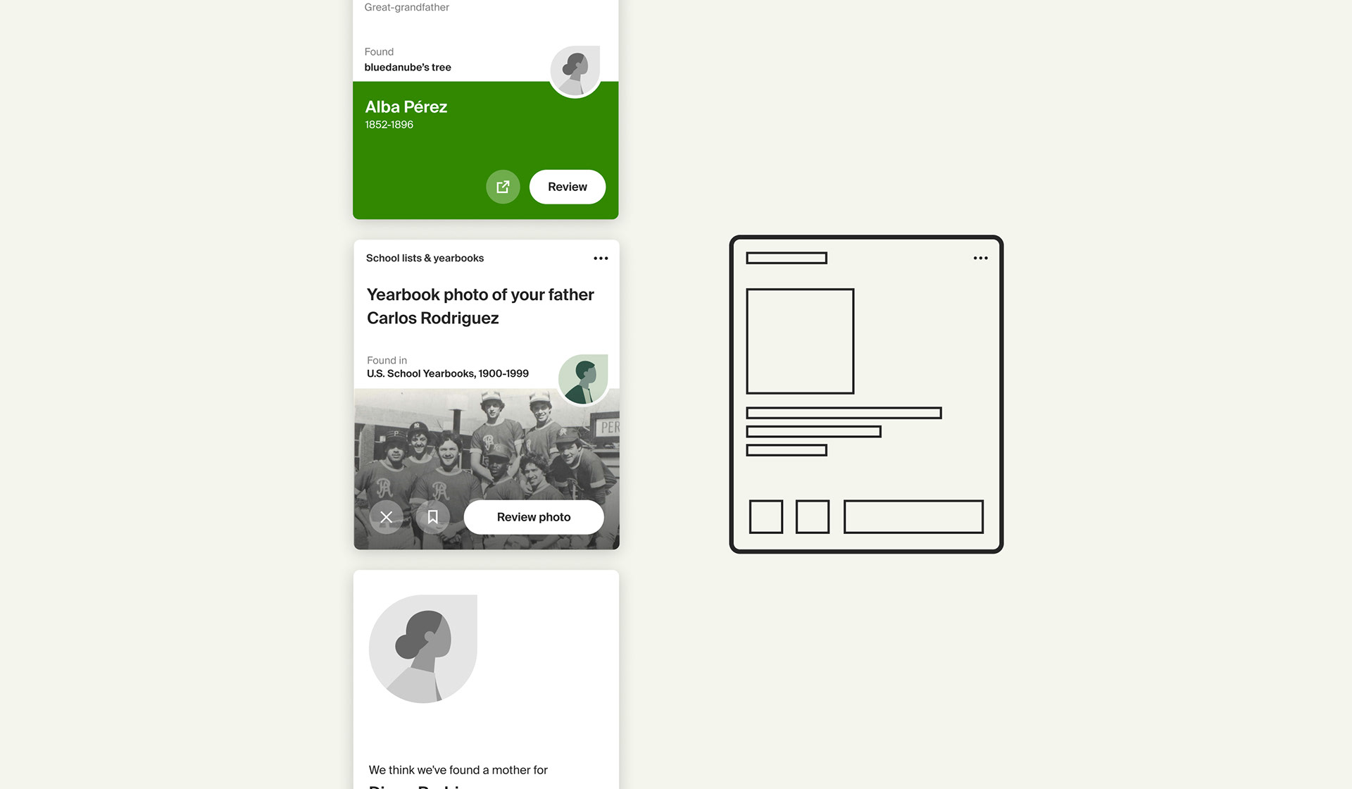
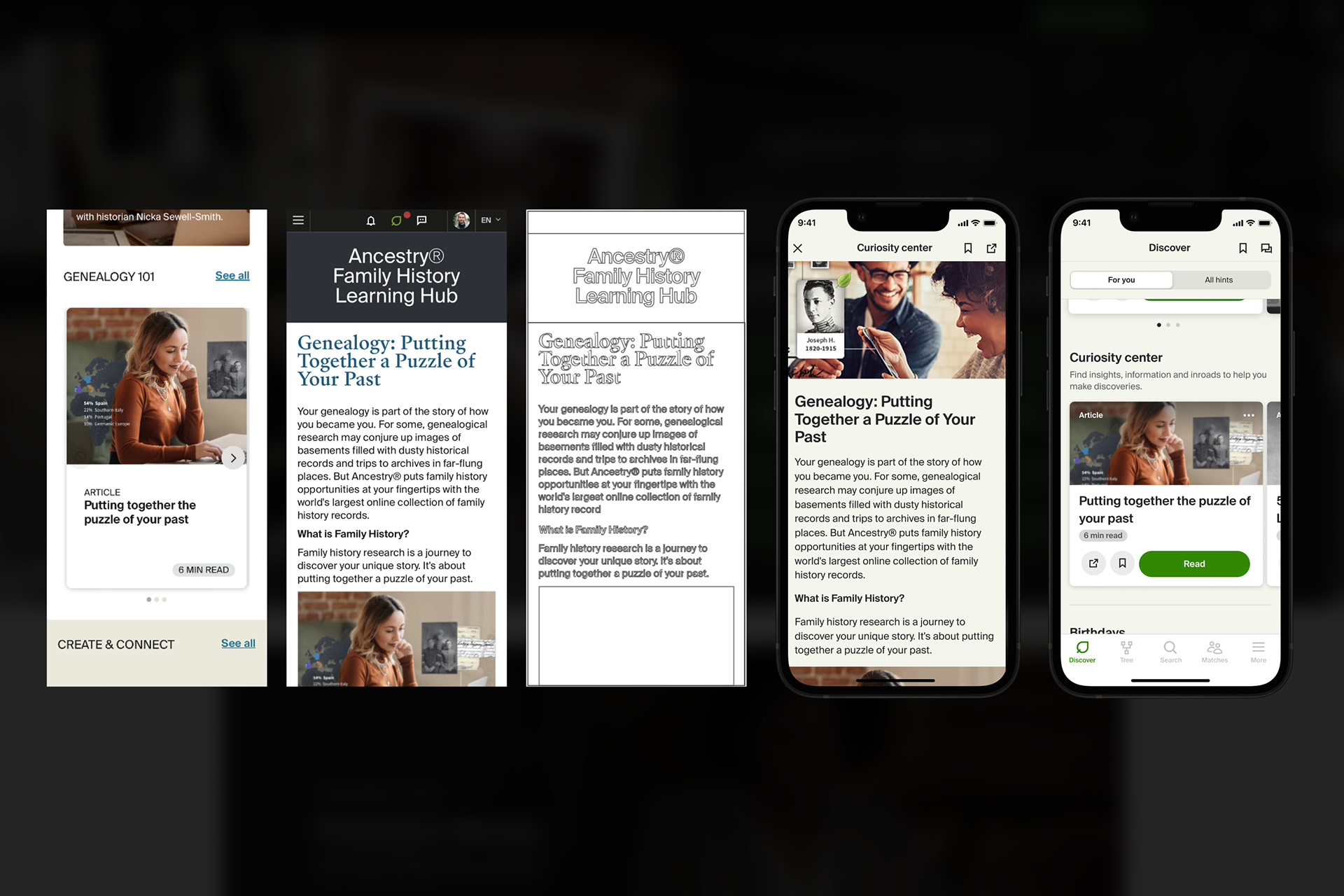
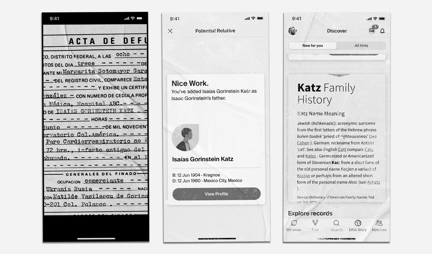
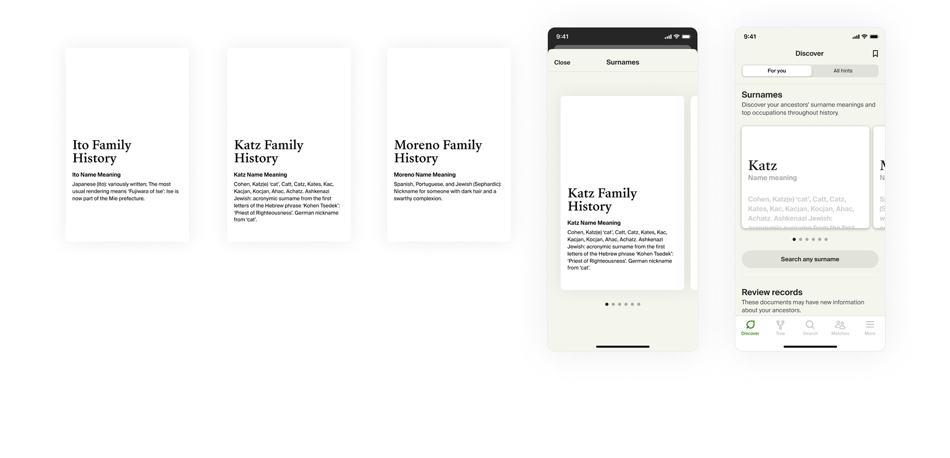
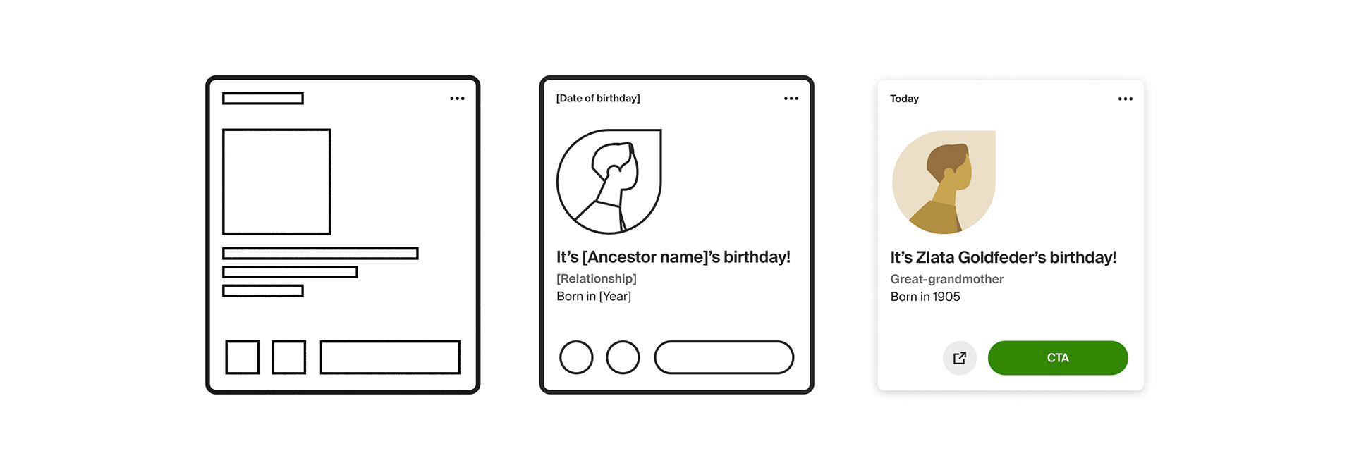
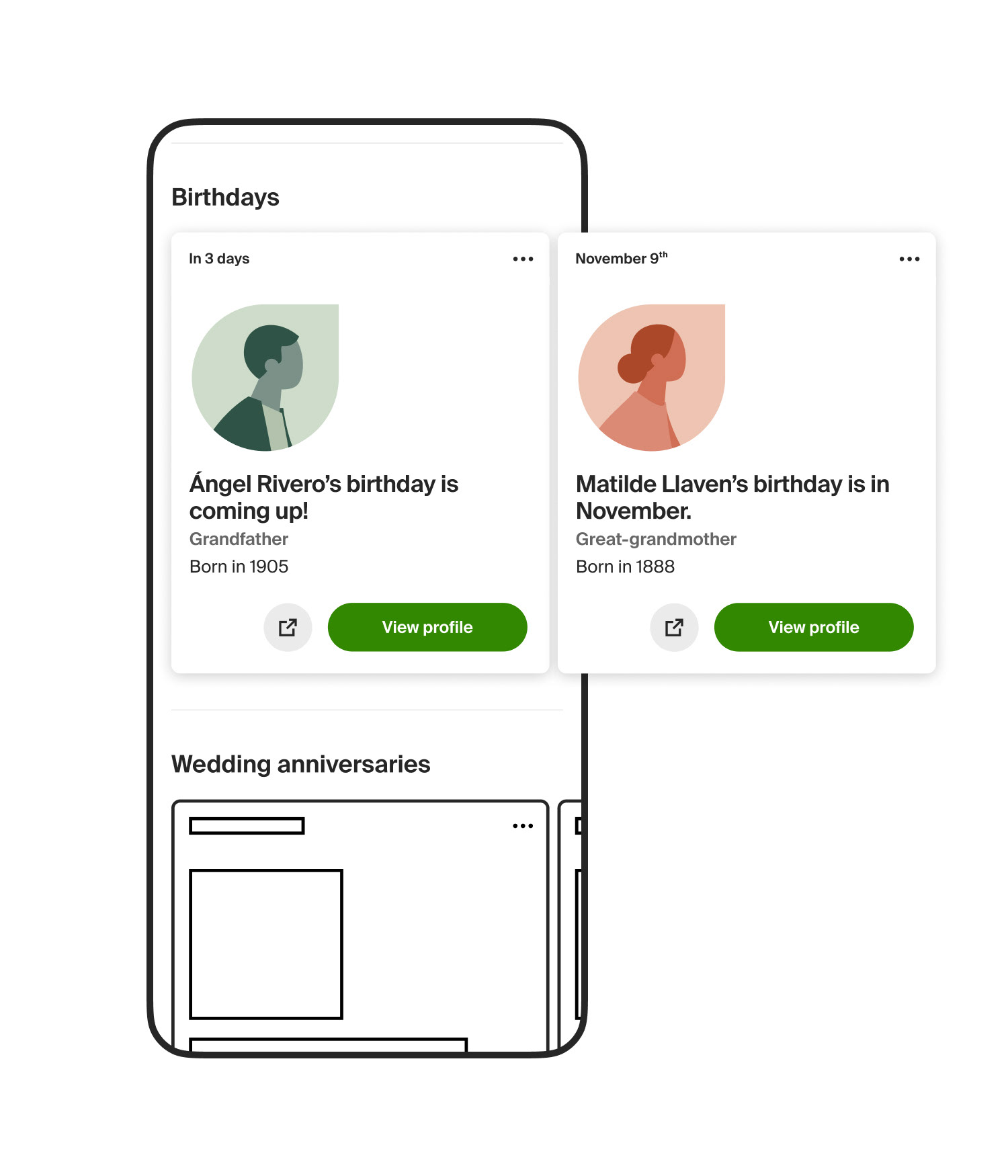
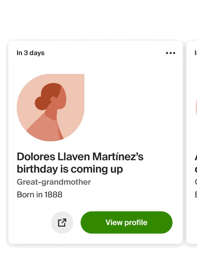
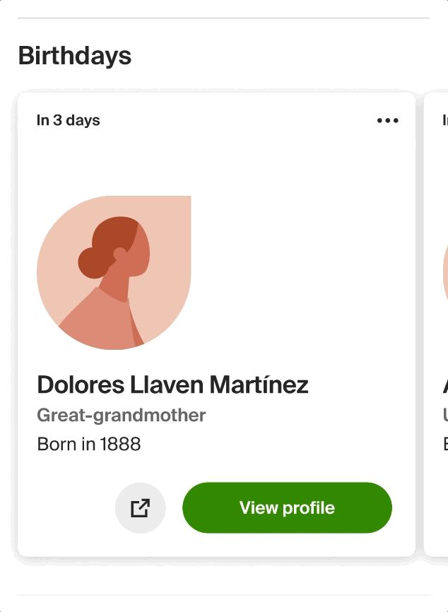
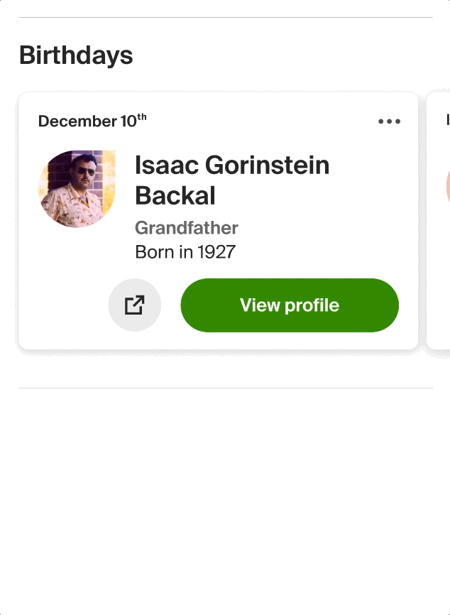
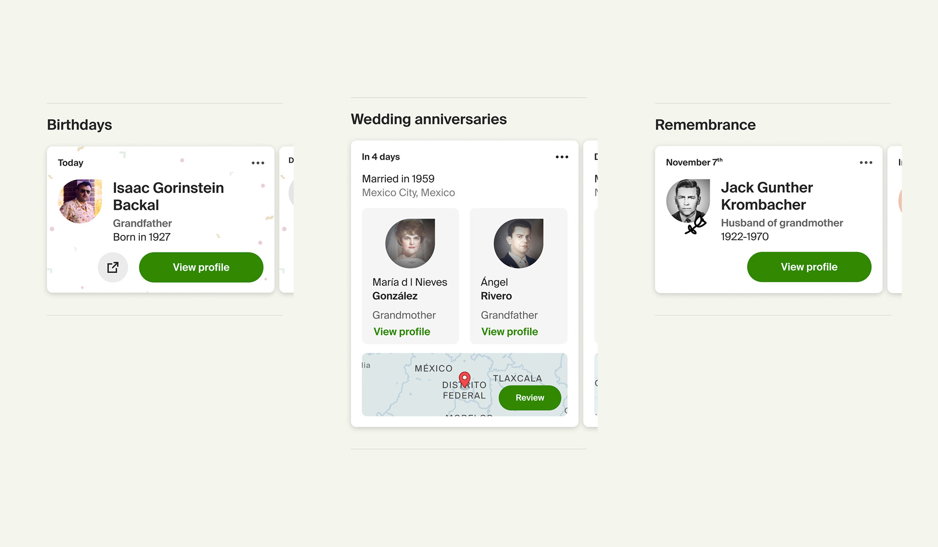
The format of the cards on the feed dictated the constraints here: a 5/4 aspect ratio, title and overflow menu at the top, a photo or avatar of a single ancestor, and a primary and optional secondary CTAs at the bottom.

The result are carousels that arrange the tree's events by date that easily open that ancestor's profile. We realized what this does is spark an internal conversation for the user, highlighting parts of the tree they might have not been researching at the time.

Also, it is often during these times of the year that families take time to remember together, so these become the perfect bit of content they might want to share outside the app.
User research feedback
After committing to a feed separated by section headers, we took time to intercept half a dozen users and have a conversation with them. Support for the idea of anniversaries sections was unanimous.

A comment that stood out to us was that given the amount of nodes in a family tree, remembering a large number of important dates is hard for even the most attentive family genealogist.

A bit of recurring feedback that surprised us was that the anniversaries sections looked like daily picks cards, so they were hard to tell apart without stopping to read each one.
After we received feedback that the cards looked too much like everything else we experienced some temptation to make them fun and different with illustration or iconography. The idea didn't fit: every ancestor's story is rich and nuanced enough that any one solution seemed to subtract rather than accompany the broader story being told.

For the wedding anniversary cards we chose to go with an institutional voice with no assumptions made about the union. We made an exception for the death anniversaries card, inspired by headstones: a single, outlined icon of a flower. The flower nicely tied together the theme of memorialization, together with the title and the format of the dates printed on the card.
Curiosity center
Lastly, we ended this phase of expansion of the feed by remembering very clearly what prompted to get on this work: when customers keep turning to their app even if there is nothing quick they can get done at that time they are signaling to us they want more of their hobby in their lives. We had these people in mind when we thought to bring closer the larger world of genealogy to the app.

We thought the customer that is in the middle of a record vetting process on their desktop and has a single minute elsewhere to dedicate to their hobby might take a lot from the breadth of good content about family history that Ancestry authors.

We imagined it as an unmistakably mobile version of the series of web articles that already existed in the Ancestry ecosystem but were never before present in the app: a highlight of an important historical record collection put in context, a helpful tip about best practices, a review of common obstacles and how to get around them, or an interesting new perspective on genealogy and genealogists.

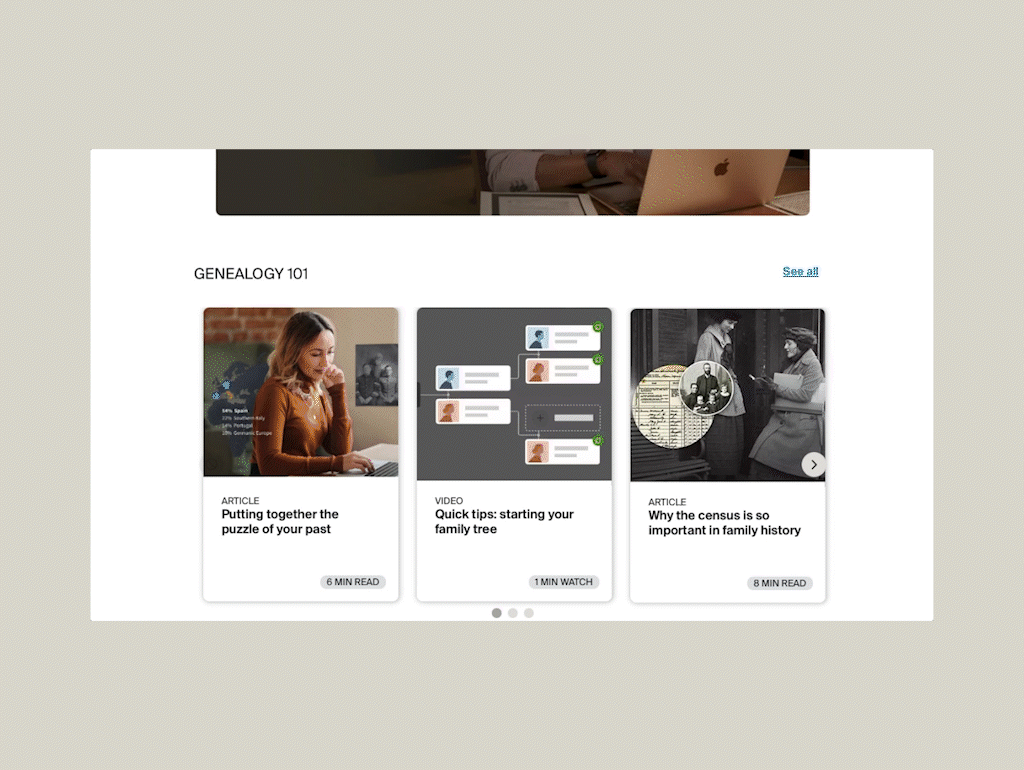
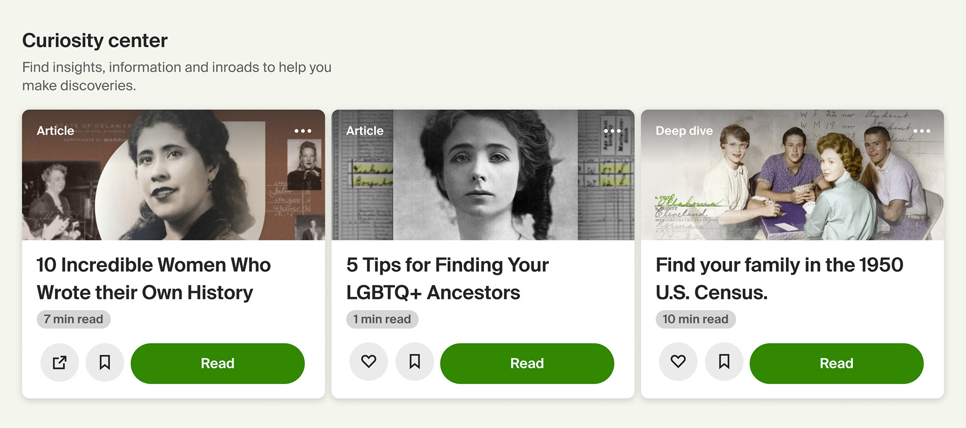
The Curiosity Center looks great on web at desktop size.

The entire feature suite
To finish the visual and interaction design, an overview look at the three features working together alongside the rest of the content in the Discover feed.
Product design hypothesis
As a mobile team we began the third quarter of 2021 wanting to capitalize on the launch of the Discover feed. At the same time, user research correlated combined desktop and app use with higher retention. So, coming into this project, our product design hypothesis was this:
If we energize the Discover feed,  then the app becomes more attractive to desktop users because these features expand upon the desktop experience and can only be accessed in the app.
Business impact hypothesis
If we introduce mobile-only features like the above, then we will positively influence stickiness and retention because combined web and app users convert and retain at a higher rate.
Results
Surnames was the first of these features to ship, in October 2021. The Curiosity Center followed in March of 2022, and Birth, Marriage, and Remembrance Events a month later.

The first metric we expected to see rise was engagement with the feed, meaning more content loaded into app sessions, more views, and more taps. A first snapshot of the data became available about a month into the launch of Surnames.
At this time there was not a lot to which it could be compared. Let's fast forward to the launch of the entire package of three features.

Looking at the data in hindsight, and at a higher level, we have a comparison of Surnames, Birth, Marriage, and Remembrance Events, Curiosity Center, and Hints Loads, Views, and Taps (named Clicks in the data):
Surnames
Birth, Marriage, and Remembrance Events
Curiosity Center
At a glance, these numbers show a clear winner: hints. Perhaps unsurprisingly, hints are the bread and butter of the genealogy hobby. So what can be said about the usage of the new content features in relation to hints in more detail:
Here we have what can perhaps be said to be some of the most interesting numbers having to do with these features:

As a note, Active Discovery Rate is the percentage of subscribers who did at least one of the following actions: accept a hint, found an ancestor or record through search, or messaged another user. Percent Engaged Users is 

The analysis and data that follows is best left to a smaller group discussion.